
B2B MATERIAL COMPARISON / FINISH GUIDE
Holographic vs Glitter vs Aurora Acrylic
Holographic, glitter and aurora acrylic can all look reflective in a photo, but they create different visual structures. Choose from the artwork, viewing condition, product shape and approval evidence, then lock a named physical material before bulk production.
This comparison page owns informational finish-selection intent. Transactional holographic stand, holographic keychain, glitter keychain and aurora stand terms remain on their individual product pages.
DIRECT ANSWER
What buyers should know about hologram vs glitter vs aurora acrylic
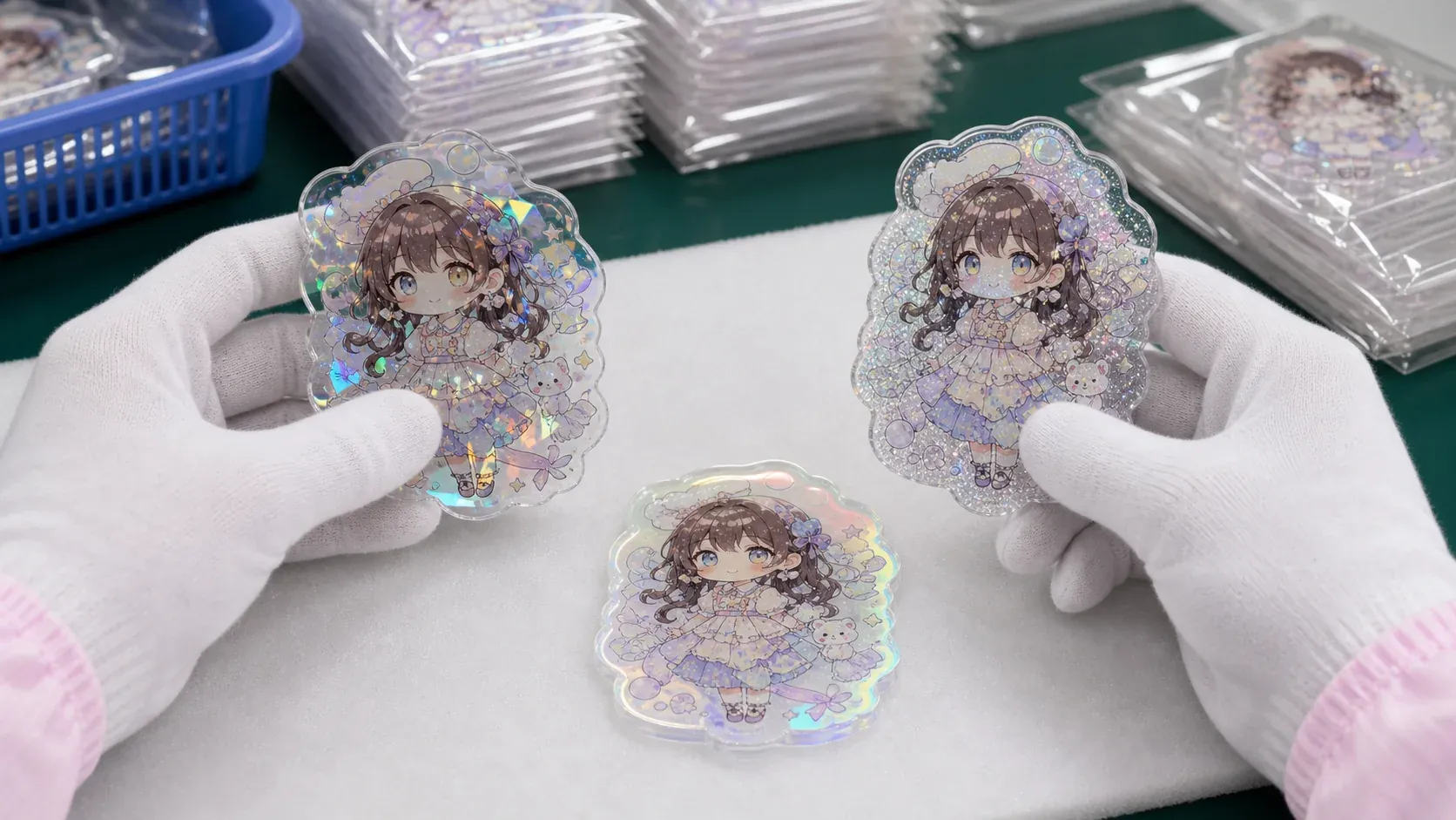
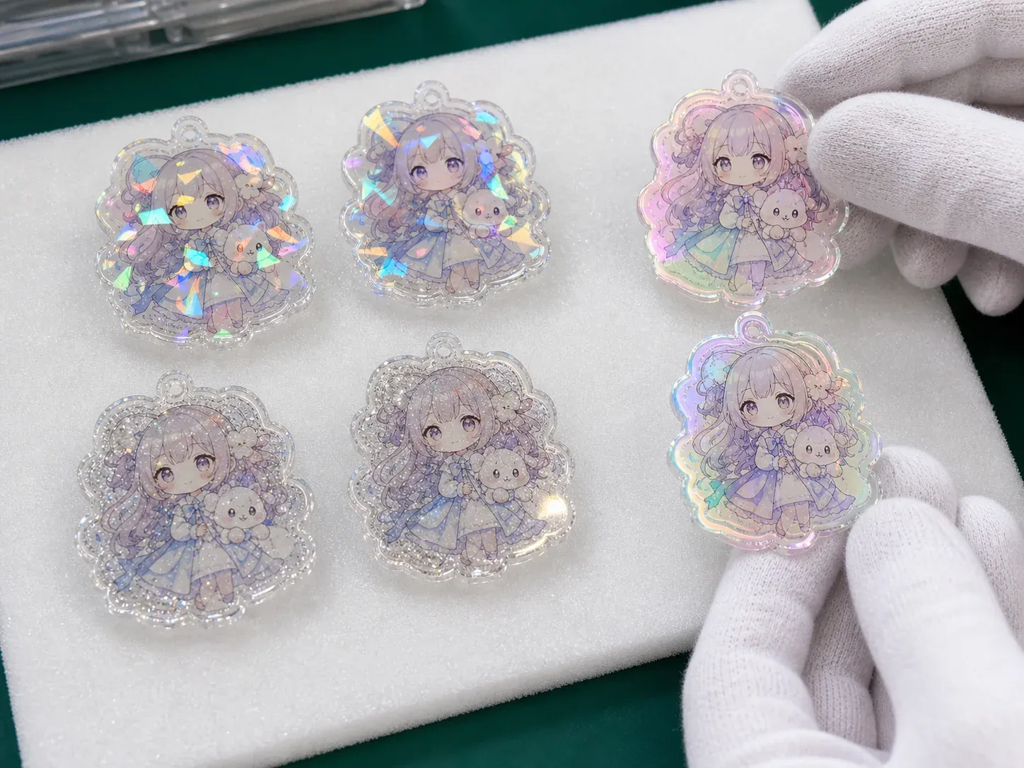
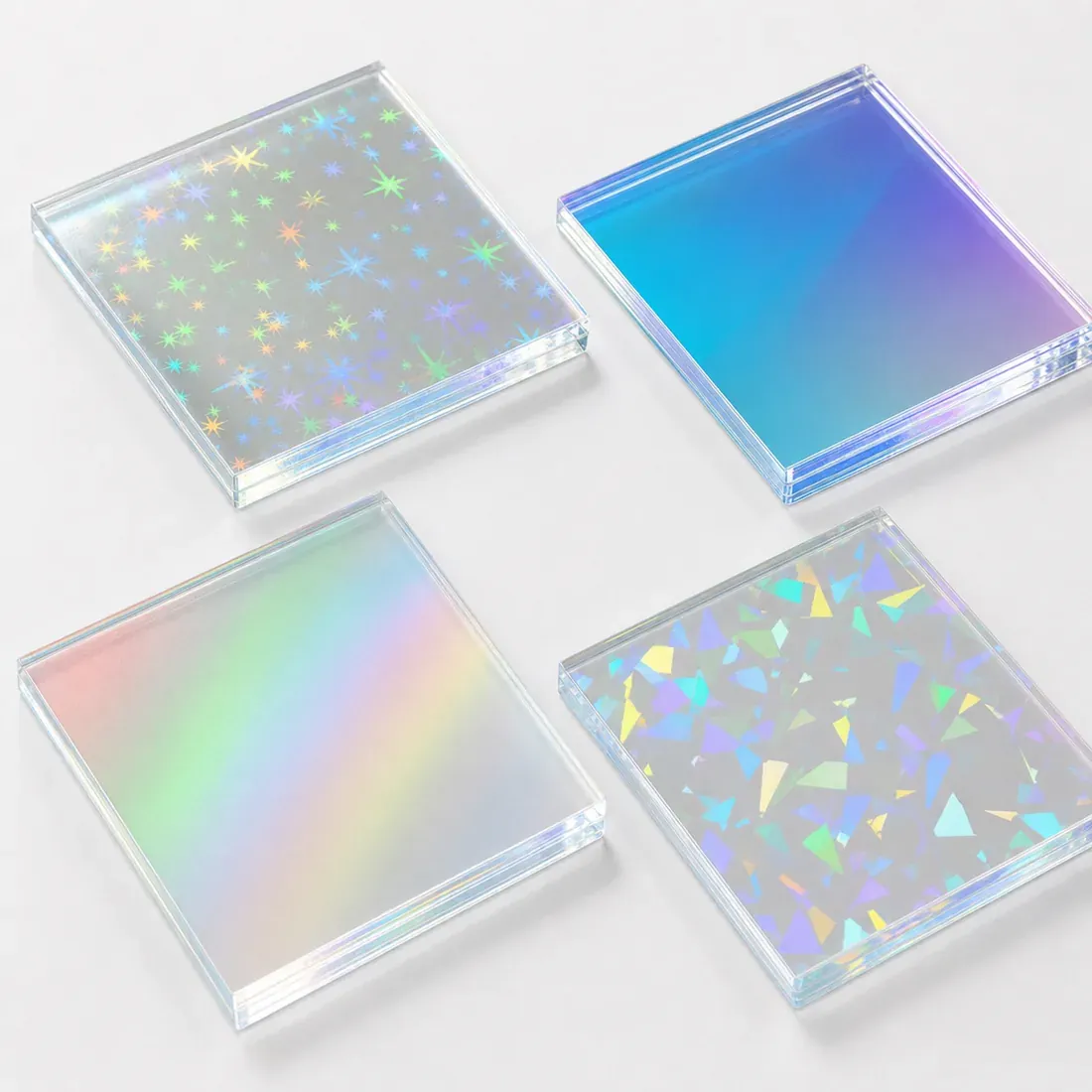
Holographic acrylic uses an optical pattern or film that produces rainbow reflections with recognizable motifs or directional behavior. Depending on the material, buyers may see stars, dots, shards, crushed ice, haze or a repeating prism pattern. Pattern scale and orientation can interact strongly with small artwork.
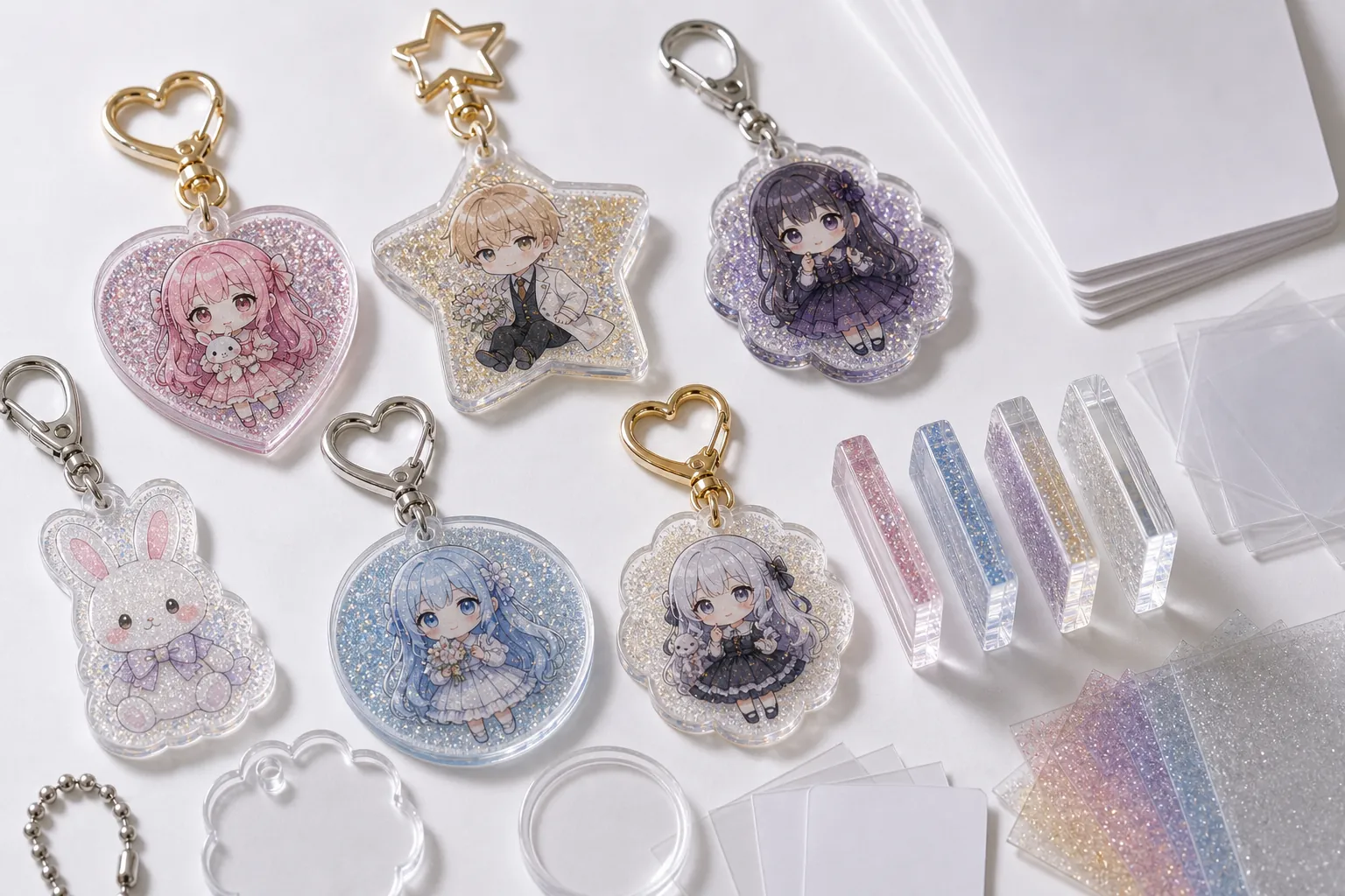
Glitter acrylic shows distinct sparkle particles, flecks or suspended reflective elements. The effect can feel granular and decorative rather than film-like. Particle size, density, color and distribution should be approved because they affect artwork readability and can vary in appearance between a close sample and a full production body.
Aurora acrylic creates a smoother iridescent color shift across the viewing angle. It may move between cool and warm reflected tones without a clearly repeated motif. A single front photo can understate the effect, so the finished sample should be tilted and compared on both light and dark backgrounds.
For the complete product family, use the Acrylic Goods OEM hub. Keep the distinct page intent in this guide instead of repeating one broad acrylic goods description.
PROJECT DECISIONS
Lock the decisions that define this page intent
A product name or channel name is not a complete production instruction. Record the decisions below before artwork, samples and packaging are released.
Optical structure
Choose visible motif, discrete sparkle or continuous color shift according to the art direction.
Viewing environment
Consider indoor ambient light, point light, camera angle and the display background.
Artwork contrast
Plan white ink and transparent zones so facial details remain readable while the effect stays visible.
Pattern orientation
Record viewing face and direction when motifs or color response change across the sheet.
SPECIFICATION CONTRACT
Build one quote-ready control sheet
Connect the artwork, physical product, package, SKU and delivery data in one revision-controlled matrix. Mark undecided fields for recommendation rather than allowing different teams to assume different specifications.
| Finish family | Holographic pattern, glitter particle or aurora color-shift family with supplier or approved sample code. |
|---|---|
| Visual reference | Physical swatch and finished printed sample viewed from front, tilt and side angles. |
| Pattern or particle | Motif, scale, direction, particle size, density, color and accepted visual range where applicable. |
| Viewing face | Front material face, sheet orientation and relationship to the upright artwork or hardware. |
| Print layers | Color, white ink, transparent zones, reverse view and any area reserved to display the finish. |
| Product geometry | Finished size, thickness, cut line, base or fitting and any narrow section that changes the visible effect. |
| QC evidence | Material identity, angle photos, print comparison, surface review and sample-to-bulk reference. |
| Packaging | Protective film, separators, sleeve, backing card and controls against scratches or face-to-face rubbing. |
PROGRAM DESIGN
Compare the three finishes by buyer decision
The best option is the one that supports the artwork and sales concept under realistic viewing conditions. No finish is universally more premium or more suitable.
Holographic
Best when a visible optical motif or directional rainbow pattern is part of the design language. Approve pattern type, scale and orientation.
Glitter
Best when distinct sparkle particles should read as a decorative texture. Approve particle color, size, density and distribution.
Aurora
Best when a clean, continuous iridescent shift should move across the product with angle. Approve color range and viewing face.
Clear or colored alternative
Use a stable transparent or tinted material when artwork clarity and predictable color are more important than changing reflections.
SAMPLE APPROVAL
Approve evidence that answers production questions
Approve a physical swatch first, then a printed finished sample. A loose swatch identifies the material family, but white ink, color coverage, cut shape and product orientation determine how much of the effect remains visible. Review the final body with its base or hardware so the normal display angle is represented.
Use more than one lighting condition. Check neutral ambient light for everyday readability, stronger point light for the maximum reflection and a light and dark background for transparency. Record accepted pattern or color-shift range rather than asking bulk pieces to match one frozen photograph.
- Named material code
- Physical swatch
- Front viewing face
- Pattern orientation
- White-ink strategy
- Light and dark backgrounds
- Finished product sample
- Bulk comparison reference

VISUAL EVIDENCE
Use real product, packing and QC references
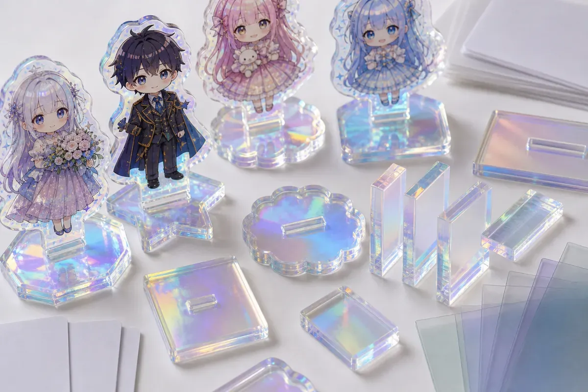
These references support product and process review. The approved physical sample and project-specific specification remain the production authority.
MASS-PRODUCTION RISK
Resolve the failure modes before the bulk release
Risk control is most useful when each failure is tied to a document, sample, inspection method or pack rule.
Finish names are treated as interchangeable
The supplier selects an optical structure that does not match the intended design.
Only a screen image is approved
Reflections, particles and angle response differ from the buyer's expectation.
White ink covers every area
Artwork becomes opaque but the selected finish has little visible role.
Pattern direction is not recorded
Stars, shards or color response appear rotated or inconsistent across the product.
Sample uses a different body size
Pattern scale and particle density read differently on the actual product.
Packed surfaces rub
Fine scratches become prominent under reflection and reduce the premium effect.
QUALITY CONTROL
Inspect against the approved SKU and sample
Use the Acrylic Quality Inspection guide to plan the sample size and evidence set. The checkpoints below keep this page's distinct buyer intent visible in QA.
| Material identity | Verify the approved holographic, glitter or aurora code and viewing face. |
|---|---|
| Optical response | Compare motif, particles or color-shift range under agreed angles and backgrounds. |
| Inspect color, white ink, registration, transparency and artwork readability. | |
| Cut and surface | Check dimensions, edge, chips, haze, scratches, bubbles or layer marks. |
| Assembly | Confirm base or hardware orientation and how the finish appears in normal use. |
| Pack protection | Verify film, separators, sleeve, label and controls against surface rubbing. |
PACKAGING AND HANDLING
Protect the product and preserve SKU identity
Packaging is part of the sellable specification. Confirm the final unit before bulk packing and use the Acrylic Scratch-Prevention Packaging guide for surface-risk planning.
Protective film
Keep the optical face protected through production and state when film is removed for inspection or sale.
Face separation
Prevent finished surfaces from contacting bases, hardware or neighboring acrylic pieces.
Display card
Use a background that does not hide the intended reflection and keeps SKU identity clear.
Sample retention
Retain the named material and packed sample as a reference for later lots or issue review.
OPERATIONAL HANDOFF
Document a finish decision that another team can reproduce
The approval sheet should state more than holographic, glitter or aurora. Include the supplier or sample code, viewing face, orientation, white-ink rule, approved photos and retained sample location. This lets purchasing and QC distinguish two materials that share a marketing name but produce different optical results.
For repeat orders, compare the new material lot to the retained reference under the same lighting and background conditions. Accept a documented visual range rather than one camera color. If the material code changes, review print readability and the finished product sample again before treating the order as a simple repeat.
QUOTE CHECKLIST
Information needed for a useful production review
Send known inputs and mark open decisions. Quantity by design, the distinct page-specific decision, packaging and destination are required to compare a practical route.
- Target finish family
- Physical sample or supplier code
- Pattern, particle or color-shift preference
- Viewing face and orientation
- Editable artwork
- White-ink and transparent zones
- Finished size and thickness
- Base or hardware
- Quantity per design
- Packaging method
- Inspection evidence
- Delivery destination and required date
PRODUCTION WORKFLOW
From buyer brief to documented shipment
Timing is confirmed after artwork, specification, sample, packaging, inspection and destination conditions are known. Do not use an unsupported fixed lead-time claim for an unreviewed project.
- 01 BriefIntent, artwork, quantity and destination
- 02 ReviewProduct, SKU, pack and risk decisions
- 03 SamplePhysical evidence for the highest-risk points
- 04 ApprovalOne final controlled revision and matrix
- 05 ProductionManufacture, sort, pack and inspect by SKU
- 06 DeliveryCarton records and agreed destination split
See the complete OEM Order Process.
FAQ
Holographic vs Glitter vs Aurora Acrylic FAQ
Is holographic acrylic the same as aurora acrylic?
Not necessarily. Holographic materials often show a motif or directional pattern, while aurora usually describes a smoother continuous color shift. Approve the physical material, not only the name.
How is glitter acrylic different from holographic acrylic?
Glitter usually shows distinct particles or flecks, while holographic acrylic uses an optical pattern or film. The visible scale, distribution and direction should be compared on real samples.
Which finish keeps artwork most readable?
Readability depends on artwork contrast, white ink, transparent zones, pattern scale and lighting. Test the final print on the selected material rather than deciding from a loose swatch.
Can one project use several finish families?
Yes. Assign a material code to each SKU and approve representative samples so packing, labels and inspection can distinguish the variants.
Why are several viewing angles required?
These finishes change with light and angle. Front, tilted and side views reveal pattern direction, sparkle, color shift and whether critical artwork remains visible.
What should be sent for a quotation?
Provide artwork, target finish or sample reference, size, thickness, quantity by design, white-ink intent, base or hardware, packaging, destination and required arrival date.
RELATED RESOURCES
Continue the procurement review
PROJECT REVIEW
Prepare the Holographic vs Glitter vs Aurora Acrylic brief
Send the artwork, project-specific decisions, quantity by SKU, packaging, inspection needs and destination. Unconfirmed fields can be marked for recommendation.