
Guide / Acrylic Goods Color Control
Acrylic Print Color Consistency
Color difference control for acrylic goods is not only about artwork data. White ink, clear acrylic, material lots, lighting, photo approval, and packaging appearance all affect the final result. This guide explains how to review color before mass production for acrylic stands, keychains, badges, coasters, blocks, and dioramas.
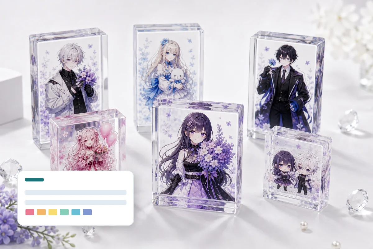
What Color Difference Control Means for Acrylic Goods
Acrylic goods color difference control means reviewing artwork data, white ink, transparent areas, print surface, approved samples, production lots, and lighting conditions under the same criteria so that mass-production color variation stays within an agreed range. For character goods, skin tones, hair colors, brand colors, pale colors, and clear effects should be defined before quotation and sampling.
30-Second Decision: When This Guide Matters
Must check
- Pale colors, skin tones, or brand colors are important
- Artwork uses clear areas or complex white plate layers
- Repeat orders need to match previous production
Decide before production
- Which approved sample is the standard
- Photo approval or physical sample approval
- Acceptable range by SKU
Extra attention
- Lighting and camera correction
- White ink density and transparency balance
- Color appearance through OPP bags or backing cards
Main Causes of Color Difference
| Artwork data | RGB/CMYK setup, spot-color notes, fine lines, gradients, transparency effects, and resolution all affect print output. Screen color and printed acrylic color do not match exactly. |
|---|---|
| White plate and clear areas | If the white plate is weak, misaligned, or too small, colors can look pale or be affected by the background. |
| Material and lot | Acrylic sheet lots, protective film, ink condition, and material color can change clarity and perceived color density. |
| Lighting and photos | Daylight, indoor lighting, smartphone correction, and monitor settings can make the same sample look different. |
| Packaging appearance | OPP bags, backing cards, clear cases, and background paper can change how the finished goods appear at retail. |
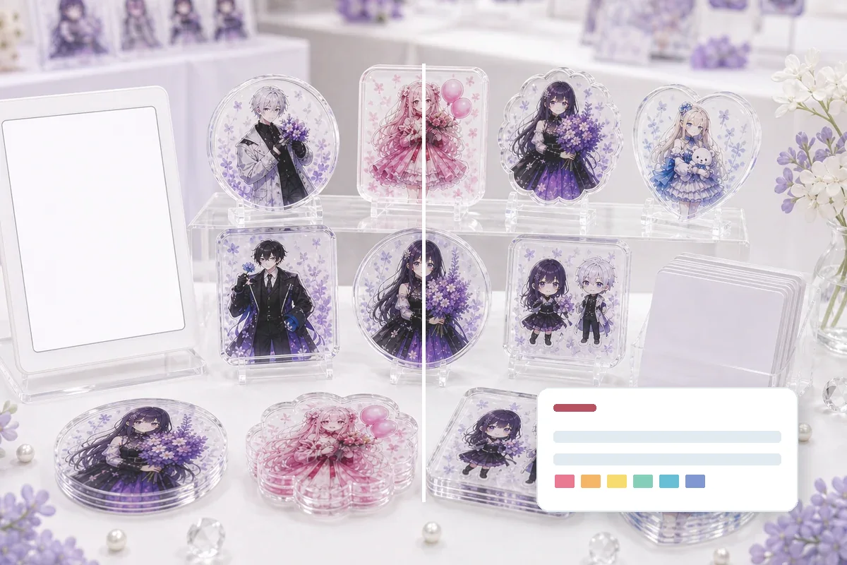
Compare Approved Samples and Production Lots Under the Same Conditions
Color control should compare the approved sample and mass-production lot using the same lighting, background, and packaging state. For multiple SKUs, separate items by character, color, backing card, and package type to detect SKU-specific drift or mixing.
- Separate approved sample, first production piece, and random production checks
- Use the same white background, lighting, and photo distance
- Record critical colors with both photos and physical samples when needed
White Plate and Transparent Areas Are the Core of Color Control
On clear acrylic, white ink placement changes color density. If a character face, hair color, costume, or brand-style color must look solid, the white plate should be defined clearly. If the design needs a clear effect, too much white ink can remove the intended transparency.
- Separate opaque areas and transparent areas in the artwork
- Check whether white plate is too close to cutlines or fine lines
- Related: Acrylic Goods Artwork Data Guide
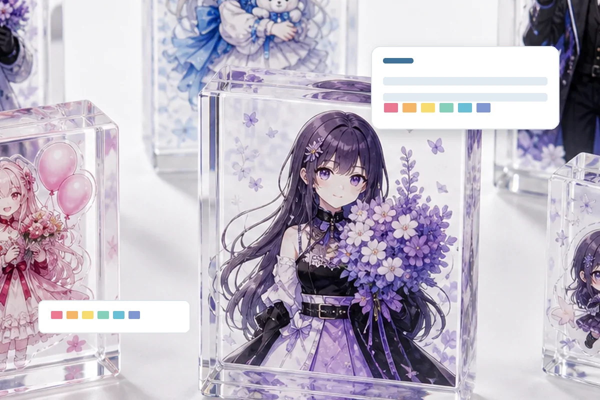
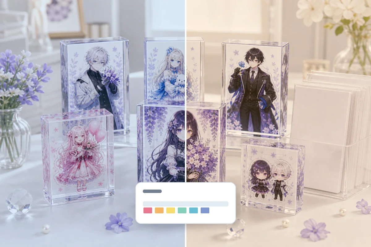
For Photo Approval, Control Lighting and Camera Correction
When approving by photo, color can shift because of the shooting location, light source, smartphone auto-correction, and monitor settings. For critical colors, combine factory photos with physical samples, previous production samples, or agreed color references.
- Match the lighting condition used for approval
- Use normal review photos, not heavily edited images
- Keep approval conditions as production evidence
Product-Specific Color Checkpoints
| Acrylic stand | Face, hair color, base, clear background, and double-sided print appearance. Review color after inserting the stand into the base. |
|---|---|
| Acrylic keychain | Small print area, hole position, hardware direction, and double-sided white plate. Pale colors can look weak when the background shows through. |
| Acrylic badge | Back hardware, backing card, and OPP-bag appearance. The backing card color can change perceived color at retail. |
| Acrylic block or coaster | Thickness, clear edge, depth, desk color, and background color can influence appearance. |
| Acrylic diorama | Background, foreground, character parts, and base pieces should be reviewed together because layers affect color balance. |
SKU Packaging and Pre-Shipment Review
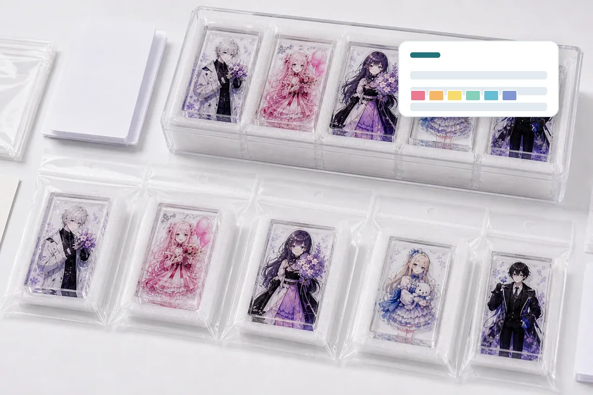
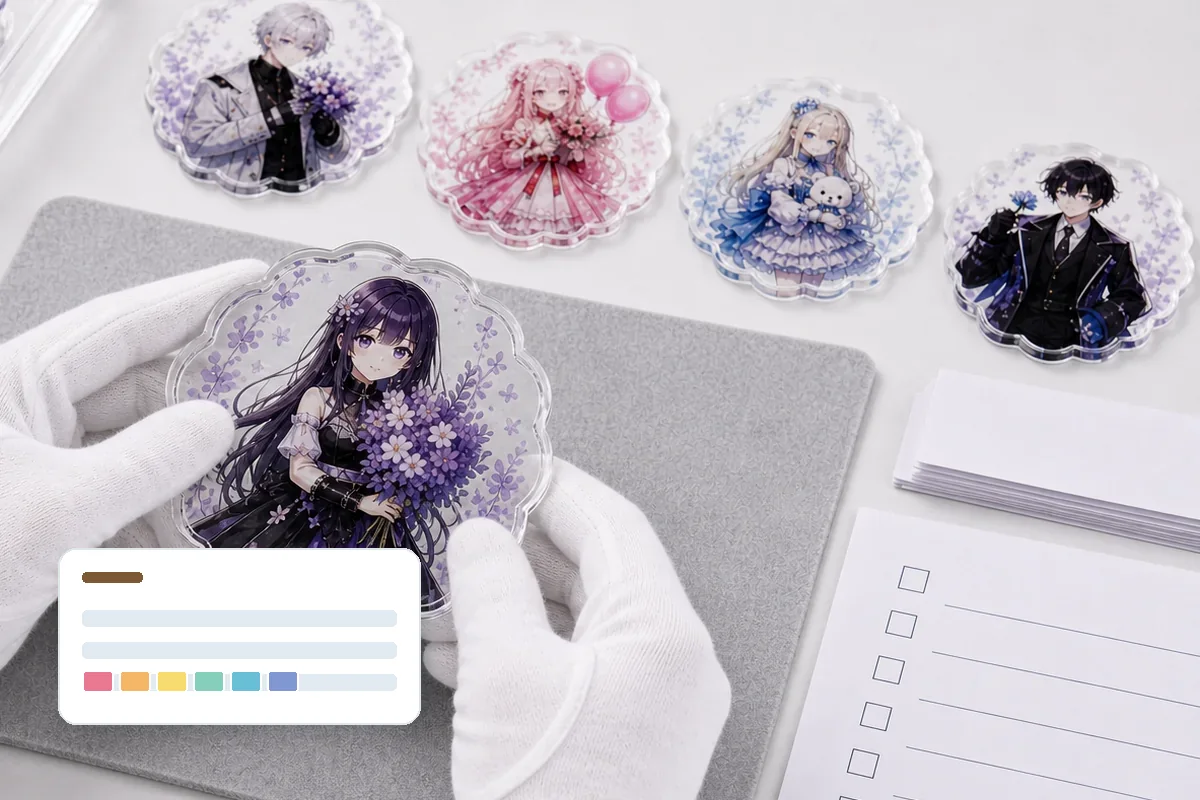
Recommended Review Order Before Mass Production
Common Problems and Prevention
Photo looks OK, physical sample looks pale
Smartphone correction and background color can make a photo look brighter. Use physical samples for critical colors.
White plate is unclear
If opaque and transparent areas are not separated, final color density can change during production.
Repeat order color is different
Keep previous samples and production goods as references, and check a new sample for repeat orders.
Quote Checklist for Color-Sensitive Acrylic Goods
| Color standard | Critical colors, previous samples, color references, approved photos, and acceptable range. |
|---|---|
| Artwork data | AI, PSD, PDF, white plate, transparent areas, SKU-by-SKU artwork, and print-side instructions. |
| Review conditions | Photo approval or physical approval, lighting, background, packaging state, and repeat-order reference. |
| Production control | Quantity, SKU sheet, packaging, backing cards, JAN labels, carton labels, and pre-shipment random checks. |
Related keywords: acrylic goods color difference control, acrylic printing color variation, white plate check, acrylic goods mass production approval, approved sample, character goods OEM, SKU sorting, DDP delivery to Japan
Frequently Asked Questions
Can color difference in acrylic goods be completely eliminated?
It cannot be reduced to absolute zero because printing, acrylic sheets, white ink, lighting, and photo conditions affect appearance. For mass production, define the approved sample, review conditions, and acceptable range first.
What should be approved before mass production?
Approve color tone, white plate, transparent areas, fine lines, cutline, print surface, packaging condition, and SKU-by-SKU appearance. Use physical samples when photo approval is not enough.
Can RGB or CMYK values alone define the color?
Color numbers are useful references, but clear acrylic, white backing, material color, printer conditions, and lighting change the final look. Critical colors should be checked with color references or physical samples.
Why does white ink affect color difference?
If the white plate is too weak, too small, or incorrectly aligned with clear areas, colors can look pale or be affected by the background. Separate opaque and transparent areas before approval.
Is smartphone photo approval enough?
It is useful for early review, but automatic correction and lighting can change color. For final approval, compare under agreed conditions and use physical samples when needed.
How do you manage color consistency across multiple SKUs?
Create a SKU sheet with names, quantities, packaging, backing cards, JAN labels, and carton labels, then compare approved samples and production lots SKU by SKU.
Can repeat orders match the previous color?
Previous samples, production goods, data, and printing notes help. However, material and printing conditions can still differ, so a confirmation sample is recommended for repeat orders.
What should I send for a quote when color control matters?
Share artwork data, target colors, critical color notes, previous sample photos, sales use, quantity, SKU sheet, packaging conditions, and target delivery date.
Related Products and Pages
Acrylic Goods Color Review and Mass Production Support
If critical colors, white plate, SKU, or packaging conditions matter, organizing the review standard before quotation helps reduce misunderstanding from sample approval to production.
Decision framework: Acrylic Print Color Consistency
Use this acrylic print color consistency to decide and document named color references, artwork color profile, white ink and acrylic substrate, controlled viewing light, physical proof and limit sample, and bulk color comparison record. The result should be an approval record that procurement, artwork, production, QC and packaging teams can apply to the same SKU.
Search intent boundary: This page owns the informational and risk-reduction intent for acrylic print color consistency. Commercial product terms remain on the related product pages, while this guide answers the pre-production decision.
What to lock before approval
A reliable decision has three parts: a written criterion, a representative finished sample and a repeatable verification method. Screenshots or verbal approvals are not enough when the decision affects material, fit, color, assembly or pack-out. The six controls below should appear in the same quotation, sample record and inspection instruction.
| Decision | What the buyer must define | Acceptable approval evidence |
|---|---|---|
| Named Color References | Define named color references by SKU before quotation and do not replace it with a vague good-quality instruction. | Keep an approved dimensioned specification or controlled reference that production and QC can identify during bulk release. |
| Artwork Color Profile | Define artwork color profile by SKU before quotation and do not replace it with a vague good-quality instruction. | Keep an approved artwork proof and component record that production and QC can identify during bulk release. |
| White Ink and Acrylic Substrate | Define white ink and acrylic substrate by SKU before quotation and do not replace it with a vague good-quality instruction. | Keep an approved representative physical sample that production and QC can identify during bulk release. |
| Controlled Viewing Light | Define controlled viewing light by SKU before quotation and do not replace it with a vague good-quality instruction. | Keep an approved sellable pack or use-condition check that production and QC can identify during bulk release. |
| Physical Proof and Limit Sample | Define physical proof and limit sample by SKU before quotation and do not replace it with a vague good-quality instruction. | Keep an approved inspection photo and measured result that production and QC can identify during bulk release. |
| Bulk Color Comparison Record | Define bulk color comparison record by SKU before quotation and do not replace it with a vague good-quality instruction. | Keep an approved SKU-linked bulk report and carton trace that production and QC can identify during bulk release. |
Failure risks to close
- Named Color References is not controlled: suppliers can interpret the same request differently and the quotation is not comparable.
- Artwork Color Profile is not controlled: the physical sample can pass while the wrong revision enters bulk production.
- White Ink and Acrylic Substrate is not controlled: packing or use conditions reveal a failure that a loose visual sample did not show.
- Controlled Viewing Light is not controlled: the buyer cannot separate an isolated defect from a repeated batch or SKU problem.
Quote inputs
- project name and target market for Acrylic Print Color Consistency
- editable artwork and the latest revision code
- finished dimensions and quantity for every design
- named color references
- artwork color profile
- white ink and acrylic substrate
- individual packaging, label and barcode requirements
- inspection evidence and acceptance criteria
- delivery destination and required arrival date
Sample-to-bulk control
Approve a finished sample that represents the intended artwork, construction and sellable package. Record the sample date, revision, dimensions, material or component codes, visual limits and function checks. If a later change affects artwork, material, hardware, assembly or packaging, identify the impacted SKUs and obtain a new approval instead of relying on the earlier sample.
For bulk inspection, use the same viewing conditions, measurement points and pass/fail language used during approval. The report should identify the purchase order, SKU, batch, sampled quantity and result. Photographs are useful evidence only when they show the relevant scale, lighting, label or test condition and can be traced to the inspected lot.
When comparing quotations, separate confirmed specifications from assumptions. Ask each supplier to identify exclusions, proposed substitutes, sampling scope, packaging labor and delivery basis. A lower figure is not equivalent when it omits a component, uses a different inspection level or assumes that several designs can share one uncontrolled pack. Close those differences before price approval so the purchase decision remains auditable.